Al Hirschfield

American caricaturist best known for his black and white portraits of celebrities and Broadway stars. known as the line king. Born in 1903, lived in New York city. One of the most important figures in contemporary drawing and caricature, having influenced countless artists, illustrators, and cartoonists. His caricatures are almost always drawings of pure line in black ink, into which Hirschfeld dipped not a pen but a genuine crow’s quill.
Hirschfeld achieved what he often sought: to capture a perfect likeness using a minimum number of lines. Hirschfeld achieved the uncanny likeness to Minnelli’s stance with only one line; Hirschfeld’s pen never left the page. Hirschfeld drew many original movie posters, which include posters for Charlie Chaplin's films, as well as The Wizard of Oz (1939). The "Rhapsody in Blue" segment in the Disney film Fantasia 2000 was inspired by his designs. Hirschfeld is famous for incorporating the name of his daughter Nina into his drawings. There are three "Nina"s in this segment: one on the end of Duke's toothpaste tube, one in the fur collar of John's wife and one in her hair. She herself is caricatured among the people rushing out of the Goldberg Hotel alongside caricatures of Hirschfeld himself.
Hirschfeld achieved what he often sought: to capture a perfect likeness using a minimum number of lines. Hirschfeld achieved the uncanny likeness to Minnelli’s stance with only one line; Hirschfeld’s pen never left the page. Hirschfeld drew many original movie posters, which include posters for Charlie Chaplin's films, as well as The Wizard of Oz (1939). The "Rhapsody in Blue" segment in the Disney film Fantasia 2000 was inspired by his designs. Hirschfeld is famous for incorporating the name of his daughter Nina into his drawings. There are three "Nina"s in this segment: one on the end of Duke's toothpaste tube, one in the fur collar of John's wife and one in her hair. She herself is caricatured among the people rushing out of the Goldberg Hotel alongside caricatures of Hirschfeld himself.
Rhapsody in blue, fantasia 2000
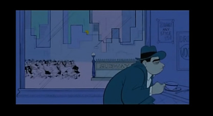
12 min long animation, one of many shorts in the fantasia 2000, with music played throughout (no dialogue) metropolis, city of New York in its palmier days, in the 1930 depression era. in the style of Al Hirschfield.
The music, Rhapsody in Blue a 1924 musical composition by American composer George Gershwin for solo piano and jazz band, which combines elements of classical music with jazz-influenced effects. The jazzy effect went with the urban american city theme, plus as it was a popular choice of music within the 1930's era in which it was based.
simple backgrounds, wash of one colour, single line (Al Hirschfeld) follow throughout the city (buildings, everything's connected)
background colour matches mood of character or mood of everyone in the whole environment (coffee shop blues)
important objects have more detail, this shows the rush of the city the subway (coffee cup advert posters are most detailed things in the scene other than the main character)
The characters colour to match their personality/ mood/ situation this particular character 'Jobless Joe' is mainly shown in different shades of blue, he is moody and sad so it seems everywhere he goes this colour 'aura' of sadness follows him and spreads, things have slowed down where he his, but there is still a chaotic rush elsewhere.
''The Broadway ending sequence of "Rhapsody In Blue" contained so many different colors (over 200), that the CAPS system had trouble rendering it''- http://www.imdb.com/title/tt0120910/trivia
http://en.wikipedia.org/wiki/Rhapsody_in_Blue
1940's font
retro 'yesteryear' style fonts
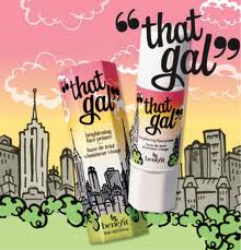
benefit makeup
soap and glory
coca cola
film posters
popular coffee shops + restaurants
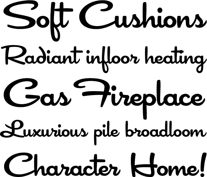
Looking up popular font styles of this era, to get an idea for the design of the coffeehouse's signpost +
how they advertised in the 1940's.
retro 'yesteryear' style fonts
benefit makeup
soap and glory
coca cola
film posters
popular coffee shops + restaurants
Looking up popular font styles of this era, to get an idea for the design of the coffeehouse's signpost +
how they advertised in the 1940's.
|
big and bold loud text sometimes outlined to catch attention matches the typical American lifestyle and language. Advertisements from five 1940s were very comical and cheesy showing the typical or 'perfect' way to live.
With the rise in the economy and surplus of money after WWII, people were very eager to update their houses. Lots of new companies focused on interior decorating & DIY ideas for mid century homes began to form and market their wares. great scenes from 1940s kitchens, bathrooms, appliances & more - Retro Renovation 

|

|
1940's,
hairstyles and
clothing,
décor
/ appliances
design research
for characters clothing, hair do's and inside the coffeehouse, style of furniture, technology etc.
appliances seem to have been made of a chunky steel or were chrome looking. Bigger was better, along with shiny and new looking 'squeaky clean' and also usually brightly coloured often red, to attract woman the main users of kitchen appliances in this era.
hair do's
Throughout history, people have worn their hair in a wide variety of styles,
largely determined by the fashions of the culture they live in. Hairstyles are
markers and signifiers of social class, age, marital status, racial
identification, political beliefs and attitudes about gender.
in the 1940's people took a lot of pride in their appearance, wore their hair neat and their clothing smart.
men often wore their hair short, and either parted on the side or in the middle, or
combed straight back, and used pomade, creams and tonics to keep their hair in place. At the
beginning of the Second World War and for some time afterwards, men's haircuts
grew shorter, mimicking the military crew-cut.
During the First World War, women around the world started to shift to
shorter hairstyles that were easier to manage. In the 1920s women started for
the first time to bob, shingle and crop their hair, often covering it with small
head-hugging cloche hats.
After the war, women started to wear their hair in softer, more natural
styles. In the early 1950s women's hair was generally inspired by famous actresses, often curly or wavy and wore in a variety of different lengths.
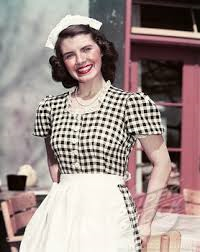
waitresses or working girls wore their hair pinned under a 'nippy' hat or up in a bun.
hairstyles and
clothing,
décor
/ appliances
design research
for characters clothing, hair do's and inside the coffeehouse, style of furniture, technology etc.
appliances seem to have been made of a chunky steel or were chrome looking. Bigger was better, along with shiny and new looking 'squeaky clean' and also usually brightly coloured often red, to attract woman the main users of kitchen appliances in this era.
hair do's
Throughout history, people have worn their hair in a wide variety of styles,
largely determined by the fashions of the culture they live in. Hairstyles are
markers and signifiers of social class, age, marital status, racial
identification, political beliefs and attitudes about gender.
in the 1940's people took a lot of pride in their appearance, wore their hair neat and their clothing smart.
men often wore their hair short, and either parted on the side or in the middle, or
combed straight back, and used pomade, creams and tonics to keep their hair in place. At the
beginning of the Second World War and for some time afterwards, men's haircuts
grew shorter, mimicking the military crew-cut.
During the First World War, women around the world started to shift to
shorter hairstyles that were easier to manage. In the 1920s women started for
the first time to bob, shingle and crop their hair, often covering it with small
head-hugging cloche hats.
After the war, women started to wear their hair in softer, more natural
styles. In the early 1950s women's hair was generally inspired by famous actresses, often curly or wavy and wore in a variety of different lengths.
waitresses or working girls wore their hair pinned under a 'nippy' hat or up in a bun.

I want for my animation the colour/ tone to be that sepia, for that classic, old fashioned, romantic look.
inspiration I found for this,
father and daughter
Michael Dudok de Wit, released in 2000
Dutch animated short film. wide Dutch landscapes live through their seasons. The characters appear as a watery ink line almost silhouetted, they move in a flowing, fantasy kind of way. the background of this I was most fascinated by, it was sort of watery tea stained looking brown paper, with a single simple ink line for the landscapes and any detail in the scene.
how to animate
rain
ttp://www.netanimations.net/Falling-rain-raindrops-dripping-rainstorm-gif-animations.htm
http://planetphotoshop.com/animated-rain.html
http://www.youtube.com/watch?v=UAfHywrVo3E
This tutorial involves creating 2 panels of rain drop images in Photoshop,
exporting them as png's, then importing and animating them in Toon Boom Animate.
The layered
effect created helps push the illusion of a seamless animated
rain loop
http://www.youtube.com/watch?v=0JfhsAAL-ps
